In leu of Thanksgiving nails, I decided to do fall nails instead. Thankfully orange is associated with Halloween and Thanksgiving, so I emphasized that color before Christmas season takes over (i.e. green, red, and blue). I included a plaid french tip design on two of my nails, a fall leaf on my ring fingers and then on my middle finger i added some craft foil and dots to make it pop. I didn't have a secure plan when i started but I'm happy with the way the designs all go together. Plus I found some great flowers in the school garden to be my background.
Welcome to WeeklyWackyNaills. This is a blog about nail art, nail polish and pretty much all else related to nails. Enjoy.:)
Search This Blog
Sunday, November 22, 2015
Thursday, November 19, 2015
Nail Art Video
Sunday, November 15, 2015
Rainbow Gradient Nails
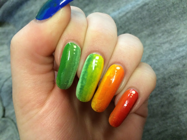
I needed a simple nail look for this week since they coincide with an ongoing art project of mine, so this is what i came up with. I took 11 nail polishes and then painted one half of each nail with a color, filling in the middle section with the acrylic paint combination of the two nail polish colors for a seamless transition between colors. I added some glitter to the tips of each nail and then three dots near my cuticles. Finishing off with two coats of top coat, I completed the look.
Sunday, November 8, 2015
Abstract See Through Nails
I didn't have a huge pull to any one nail design this week so i just let the paint do the talking and created this simple abstract design. I started with a pink/orange shimmery see through nail polish and then just used acrylic paint for the design portion. Finishing off with two top coats this design only took and hour and a half, which is short for me!
I'm amazed i haven't broken a nail yet, knock on wood.
Thursday, November 5, 2015
Trippy Colored Light/Shadow Art
Thought i would share this art exercise with y'all because I'm obsessed with how this all came out. Using three different colored lights; red, green, and blue; and with cut out paper i was able to create these designs with shadows on the adjacent wall.
Subscribe to:
Comments (Atom)


